Dynamic Form
Dynamic Form is useful for creating standard forms, enabling quick prototyping and compliance with accessibility and tracking standards.
Depending on the level of customization and integration pattern required, we can implement Dynamic Forms in different ways.
1. Dynamic Form Configuration
Dynamic Form Configuration offers a no-code approach for creating standard forms by simply updating the page configuration.
To utilize Dynamic Forms in your journey, add a form object along with an id. Within the form object, you have the option to specify layout, fields, and acl as needed.
// Page configuration
{
  "id": "page-a",
  "blocks": [
    {
      "id": "my-dynamic-form",
      "form": {
        "layout": {
          "type": "ONE_COLUMN"
        },
        "fields": [],
        "acl": []
      }
    }
  ]
}
The Dynamic Form was also presented as a part of the ScaleUp! Initiative. A recording of that session, with a demo of the Dynamic Form, can be found here.
1.1. Dynamic Form Playground
The following playgrounds allow it to configure a Dynamic Form in real-time directly in the browser:
- Retail: https://fde-dfpretaildev-eue2e3fhc5gwenh7.a03.azurefd.net/
- Expert: https://fde-dfpexpertdev-cacwe6dqe3h2b4f6.a03.azurefd.net/
The editor in the playground provides a full JSON-Schema integration. Trigger the autocomplete (Either via Ctrl/Cmd+Space or Ctrl/Cmd+i) to get support for the configuration.
A configuration from the playground can directly be used in the form attribute inside a journey configuration.
1.2. Layout
💡 For detailed visual specifications and spacing guidelines, refer to the Dynamic Form Figma Documentation.
Dynamic Forms support various layout options, including the ability to apply the same size to all elements in a form and the option to mix different sizes. For Retail Journeys everything inside Dynamic Forms is left-aligned by default, except headlines and paragraphs, which are centered by default. For Expert journeys everything is left-aligned by default. If the layout option is not provided, form elements will be rendered as one column.
You can use the options ONE_COLUMN, TWO_COLUMN, THREE_COLUMN, or FOUR_COLUMN to equally divide form elements into specified columns.
You can fine-tune how headlines and paragraphs behave in terms of width with the following optional properties:
headlineWidthMatchesLayoutType: Determines whether headline fields follow the layout column structure or always span the full width. E.g. in aTWO_COLUMNlayout, setting this to true will make headlines span only one column (instead of full width). Defaults to false. This option is ignored in aCUSTOM_COLUMNlayout.paragraphWidthMatchesLayoutType: Similar toheadlineWidthMatchesLayoutType, but for paragraph fields. This option is ignored in aCUSTOM_COLUMNlayout.
// Page configuration
{
  "id": "page-a",
  "blocks": [
    {
      "id": "my-dynamic-form",
      "form": {
        "layout": {
          "type": "ONE_COLUMN",
          "headlineWidthMatchesLayoutType": true, // optional, default: false
          "paragraphWidthMatchesLayoutType": true // optional, default: false
        },
        "fields": []
      }
    }
  ]
}
If you want to mix different sizes within a form, the CUSTOM_COLUMN option allows you to specify how many column(s) each element should span. The number can be 1-12, following the 12-column grid system.
It's also possible to make form fields center-aligned in retail journeys by setting centerAlignInRetail in the layout object. This option is applicable to single field components only, e.g., INPUT, DROPDOWN, DATE, TEXT_AREA. If centerAlignInRetail is set to true, the field will become the only field in the row automatically.
// Page configuration
{
  "id": "page-a",
  "blocks": [
    {
      "id": "my-dynamic-form",
      "form": {
        "layout": {
          "type": "CUSTOM_COLUMN"
        },
        "fields": [
          {
            "id": "firstInput",
            "type": "INPUT",
            "inputType": "text",
            "label": "First input",
            "columnSpan": 3,
            "layout": {
              "centerAlignInRetail": true
            }
          },
          {
            "id": "secondInput",
            "type": "INPUT",
            "inputType": "text",
            "label": "Second input",
            "columnSpan": 9
          }
        ]
      }
    }
  ]
}
Overriding the number of grid columns
When a dynamic form is nested inside an element that only occupies a fraction of the page width, the default 12-column subdivision may not satisfy all possible layouts.
To address this, the CSS custom property --df-custom-columns can be set on the df-form element, or any of its ancestors, to override the number of grid columns:
df-form {
  --df-custom-columns: 5;
}
💡 When using
--df-custom-columns,columnSpanvalues must not exceed the custom column count. For example, with--df-custom-columns: 5, use maximumcolumnSpan: 5.
💡
--df-custom-columnsvalues are clamped to the range[2, 12]. Values below 2 are treated as 2, and values above 12 are treated as 12 (the upper bound matches the maximum columnSpan supported).
Apart from that, in Expert journeys the 12 columns of a Dynamic Form take the 6 most-left columns of the NDBX grid by default. If you want your form to take the 12 columns of the NDBX grid, you need to set the fullWidthFormInExpert option to true in your form's layout configuration.
// Page configuration
{
  "id": "page-a",
  "blocks": [
    {
      "id": "my-dynamic-form",
      "form": {
        "layout": {
          "type": "ONE_COLUMN",
          "fullWidthFormInExpert": true
        },
        "fields": [
          {
            // ...
          },
          {
            // ...
          }
        ]
      }
    }
  ]
}
The CUSTOM_COLUMN layout allows configuring complex layouts like in the following form (The Figma version is available here):
Open this form in the Dynamic Form playground.
Responsive behavior
The Dynamic Form applies its responsive behavior using container queries, with the taly-dynamic-form container as the reference. Layout currently only changes at a single breakpoint of 416px.
1.3. Fields
The fields configuration allows you to add elements to a form. Each element requires a different configuration depending on its type. However, all elements need to have an id and type set.
// Page configuration
{
  "id": "my-page",
  "blocks": [
    {
      "id": "my-dynamic-form",
      "form": {
        "fields": [
          {
            // The field's id should be written in camel case to make it easier to locate the state key
            "id": "myInput",
            // Type of the element which influences the rest of the configuration
            "type": "INPUT",
            "inputType": "text",
            "label": "Please enter your first name(s)",
            "infoIcon": {
              "popoverText": "text with [link](http://example.com) and list\n- item 1\n- [list link](http://example.com)",
              "popoverDirection": "top"
            }
          }
        ]
      }
    }
  ]
}
Such configuration will produce the following form input:
As you can see, it is possible to configure an info icon with a popover for any field. The popover is opened when clicking the info icon. By default, it is opened to the bottom of the icon, and it can be configured to be opened to the top, left, or right. The text inside the popover can contain lists and links in the Markdown format, which TALY will transform to the corresponding NDBX components.
The configuration details of each element can be found below:
| Type | Documentation |
|---|---|
CHECKBOX | Checkbox Component |
CHECKBOX_GROUP | Checkbox Group Component |
CIRCLE_TOGGLE_GROUP | Circle Toggle Group Component |
DATE | Date Component |
DROPDOWN | Dropdown Component |
HEADLINE | Headline Component |
INPUT | Input Component |
LINE_BREAK | Line Break Component |
NOTIFICATION | Notification Component |
NUMBER_STEPPER | Number Stepper Component |
PARAGRAPH | Paragraph Component |
PHONE_INPUT | Phone Input Component |
RADIO | Radio Component |
RATING | Rating Component |
SWITCHER | Switcher Component |
TEXT_AREA | Text Area Component |
TILE | Tile Component |
TIME | Time Component |
TOGGLE_BUTTON | Toggle Button Component |
💡 Dynamic Form validators are similar to Building Block validators. More details about validators configuration can be found in the Building Block section.
1.4. Special Field: LINE_BREAK
To force a new line for the following form fields, you can add a LINE_BREAK field. In the example below, the field "another field" will appear on the next line, regardless of the form layout:
// Page configuration
{
  "id": "my-page",
  "blocks": [
    {
      "id": "my-dynamic-form",
      "form": {
        "fields": [
          {
            "id": "some-field"
            // ...
          },
          {
            "type": "LINE_BREAK"
          },
          {
            "id": "another-field"
            // ...
          }
        ]
      }
    }
  ]
}
The LINE_BREAK field does not require an id.
1.5. Custom Fields
You can use custom Dynamic Form components if the above list of built-in Dynamic Form fields is not enough for your use-case. Custom Dynamic Form components are provided through TALY plugins. If you want to provide your own custom component, take a look at the corresponding Plugins documentation.
A journey configuration that's using an imaginary TALY plugin library my-plugin-library that provides a custom Dynamic Form component called MyCustomComponent in a module called CustomDynamicFormComponentModule could look like this:
// pages.jsonc
{
  "libraries": [{ "package": "my-plugin-library", "version": "13.3.7" }],
  "plugins": [
    {
      "package": "my-plugin-library",
      "modules": [{ "name": "CustomDynamicFormComponentModule" }]
    }
  ],
  "pages": [
    {
      "id": "my-page",
      "blocks": [
        {
          "id": "my-form",
          "form": {
            "fields": [
              {
                "type": "CUSTOM_COMPONENT", // has to be "CUSTOM_COMPONENT" if you want to use a custom component
                "name": "MyCustomComponent", // the name of the custom component that was added by the TALY plugin
                "label": "Label for my custom component",
                // ... further field configuration. Use the autocompletion in your IDE.
                // See the schema here: https://taly.frameworks.allianz.io/interfaces/DfCustomComponentConfig.html
                "config": {
                  // any additional configuration for this custom component
                }
              }
            ]
          }
        }
      ]
    }
  ]
}
1.6. ACL
To make Dynamic Form configurations portable, TALY supports setting ACL rules directly at the form and field levels.
The form-level ACL configuration allows path, state and condition properties. If you are not familiar with them, please take a look at our ACL documentation.
// Page configuration
{
  "id": "my-page",
  "blocks": [
    {
      "id": "my-dynamic-form",
      "form": {
        "acl": [
          {
            //The path can be an asterisk (*) to target all children fields
            // or an id of the child field.
            "path": "myHeadline",
            "state": "hidden",
            // The condition must be written in this format.
            // Please be careful of the usage of single and double quotes.
            "condition": "s(\"$['my-dynamic-form'].myRadioButtons\") == \"first\""
          }
        ],
        "fields": []
      }
    }
  ]
}
The field-level ACL configuration allows only state and condition properties. All ACL rules are applied to the attached field by default.
// Page configuration
{
  "id": "my-page",
  "blocks": [
    {
      "id": "my-dynamic-form",
      "form": {
        "fields": [
          {
            "id": "myInputField",
            "type": "INPUT",
            // All rules are applied to "myInputField"
            "acl": [
              {
                "state": "disabled",
                // The condition must be written in this format.
                // Please be careful of the usage of single and double quotes.
                "condition": "s(\"$['my-dynamic-form'].myRadioButtons\")"
              }
            ]
          }
        ]
      }
    }
  ]
}
1.7. Form Control Events
Dynamic Form configurations allow controlling what should happen when a form field's ngOnInit is triggered, when the value of a form field changes and when the form element loses the focus. You can either configure a PFE action or service activator as event handlers.
The following examples show how to configure the event handlers for a form field by providing the ID of the global PFE action or service activator. Alternatively, you can provide a full PFE action or service activator configuration.
Example :// Dynamic Form's input field
{
"id": "my-input",
"type": "INPUT",
"inputType": "text",
"label": "This is an input field",
"onInitEvent": {
"handlerType": "PFE_ACTION",
"config": {
"globalConfigId": "myPfeAction"
}
},
"onValueChangesEvent": {
"handlerType": "PFE_ACTION",
"config": {
"globalConfigId": "anotherPfeAction"
}
},
"onBlurEvent": {
"handlerType": "PFE_SERVICE_ACTIVATOR",
"config": {
"globalConfigId": "myServiceActivator"
}
}
}You can also configure events for custom components. The following example shows how to configure the event handler for a custom component:
Example :// Dynamic Form's input field
{
"type": "CUSTOM_COMPONENT",
"name": "MyCustomComponent",
"label": "Label for my custom component",
"config": {
"myCustomEvent": {
"handlerType": "PFE_ACTION",
"config": {
"globalConfigId": "myPfeAction"
}
}
}
}For more information about PFE actions and service activators, please check their respective docs here and here.
1.8. Internationalization & Using State Data in Journey Configuration Texts
All string properties that are visible to the user are translatable by default. You can follow the internationalization guide for translation instructions.
Additionally, you can use interpolation within string properties to display a value from the PFE state. For example:
Example :// Dynamic Form's input field
{
"id": "myInput",
"type": "INPUT",
"inputType": "text",
"label": "Hello {$['my-bb'].person.firstName}!",
"placeholder": "Hello {$['my-bb'].person.firstName}!"
}When providing an initial value for a field, you can provide a JSONPath expression (like for field nickName in the snippet below).
The value of your Dynamic Form field will update whenever the state at the given JSONPath expression changes but changing the value of the field will not update the state at the given JSONPath expression.
{
  "id": "nickName",
  "type": "INPUT",
  "inputType": "text",
  "label": "Nick Name",
  "value": "$.thisForm.firstName"
},
{
  "id": "firstName",
  "type": "INPUT",
  "inputType": "text",
  "label": "First Name"
}
This example in the playground demonstrates a few possibilities of interaction.
2. Dynamic Form Custom Building Block
The Dynamic Form Custom Building Block is useful when we want to customize multiple aspects that cannot be set through page configuration (e.g., styling) while keeping support for the main features (e.g., business events).
To create a custom Building Block for Dynamic Forms please refer to: Using Dynamic Forms Inside a Building Block.
3. Dynamic Form Standalone
💡 Outside of TALY-generated journeys, Dynamic Form Standalone is the only way to integrate Dynamic Form into your application.
The Dynamic Form standalone component taly-dynamic-form can be used in any Angular application as it does not have any dependency towards other parts of TALY.
The purpose of the component is to render a form that can be updated at runtime every time the configuration input changes.
The component supports dynamic validators. Make sure to provide the DfDynamicValidatorService to ensure this works correctly. This step can be ignored if you don't use dynamic validators in your application.
import { DfDynamicValidatorService } from '@allianz/taly-core/dynamic-form';
import { PfeDynamicValidatorService } from '@allianz/taly-pfe-connector';

@NgModule({
  imports: [...],
  declarations: [...],
  providers: [
    ...,
    {
      provide: DfDynamicValidatorService,
      useClass: PfeDynamicValidatorService,
    },
  ]
})
For more detailed implementation examples, have a look at the Dynamic Form Standalone recipe
4. Dynamic Form Editor
The Dynamic Form Editor is a visual editor for Dynamic Form configurations included in the DF debugger developer tool. With this tool, you can easily modify Dynamic Forms directly within your running journey, as it offers a user-friendly interface with real-time preview capabilities.
💡 The Dynamic Form Editor uses Monaco to edit the configuration. This means that, in addition to setting the
Example :showDevtoolsflag totrue, you need to make sure that the following Monaco assets are correctly imported in your project:{ "glob": "**/*", "input": "node_modules/monaco-editor", "output": "/assets/monaco/" }
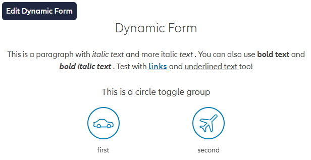
Once the developer tool is enabled, you can open the editor by hovering over the Dynamic Form that you wish to edit and clicking on the Edit Dynamic Form button that will show up in the top-left corner:
This will open the Dynamic Form Editor, where you can edit the configuration in the right panel and see a real-time preview of the form on the left side:
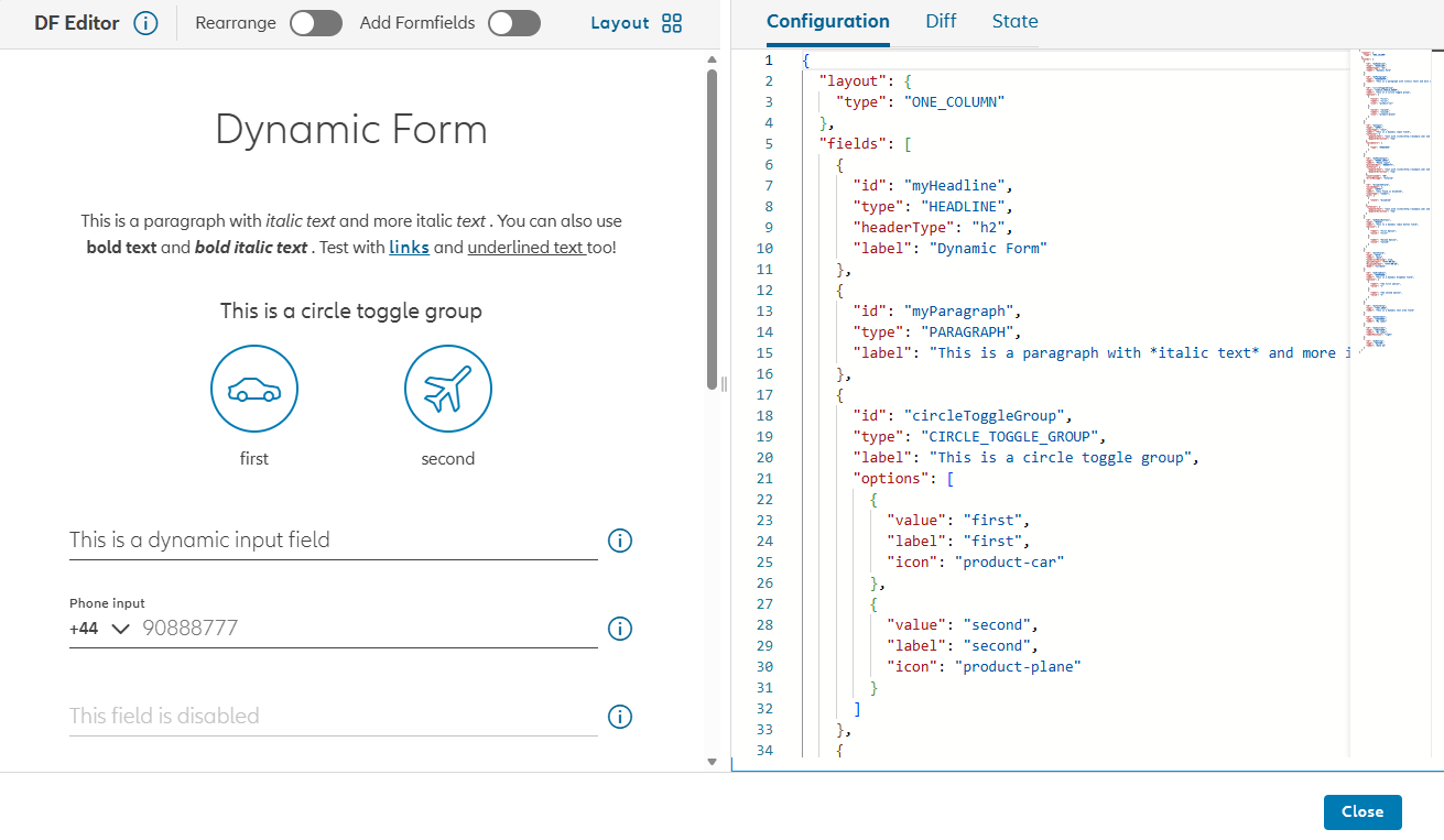
With this editor, you can quickly experiment with different configurations and see how they affect the form's appearance and behavior. You can add, remove, and rearrange form fields, change the layout and edit the JSON configuration directly. On the right side, you can check the changes applied in the editor in the Diff tab, as well as take a look at the current state of the form in the State tab.